Thursday, 20 December 2012

Powerful Preceding

The preceding load functionality in the QlikView load script is extremely powerful for transforming data.

Many developers will never use it.  They simply use SQL queries to format their data and transform it.  Others may use it - but accidentally.  They turned the "Preceding Load" check box on in the "Select" data wizard during training and have never turned it off.  They get a simple SQL statement like:

SQL SELECT * FROM TableName;

And barely notice that there is a QlikView Load statement sitting above it.

This is brilliant though - just because it is a QlikView statement.  This means that we can use the great set of QlikView functions within this statement.  From the simple Year or Month, to parse a date, to the most useful ApplyMap - one I use all the time.

Even there, we are not finished.  We can add additional Preceding Load statements above other Preceding Load statements!

Another thing that some people may not realize is that Preceding Load statements can include their own WHERE and GROUP BY clauses.  This is really powerful.

For a quick example, I want to load in a list of Father Ted episode from:

http://en.wikipedia.org/wiki/List_of_Father_Ted_episodes

I start off with the normal QlikView file wizard:


I see an immediate problem here.  There are 3 columns but there is a 4th column of data wrapped onto the next row.  The simple QlikView script to load this will look like this:


LOAD F1 as Episode, 
     Title, 
     [Original airdate]
FROM
[http://en.wikipedia.org/wiki/List_of_Father_Ted_episodes]
(html, codepage is 1252, embedded labels, table is @3);


Looking at this in a table box shows me the problem.


I need to come up with a simple rule - if the Episode field is numeric, that line has Episode, Title and Original airdate.  If not, that line has the description.  I can then re-craft my load like this:


Load
if(IsNum(Episode), Episode, Previous(Episode)) As Episode,
if(IsNum(Episode), Title, Previous(Title)) As Title,
if(IsNum(Episode), [Original airdate], Previous([Original airdate])) As [Original airdate],
if(IsNum(Episode), Null(), Episode) As Description;
LOAD F1 as Episode, 
     Title, 
     [Original airdate]
FROM
[http://en.wikipedia.org/wiki/List_of_Father_Ted_episodes]
(html, codepage is 1252, embedded labels, table is @3);


Here I have put a Preceding Load on top of the original.  I am checking if the Episode value is numeric.  If it is, I use that value for Episode and use Title for Title and Original airdate for Original airdate.  I use the Null() function to create a blank Description field.  If the Episode field is not numeric, I then grab the Previous values for Episode, Title and Original airdate and use the new text value of Episode as my description.  This leaves me with:


Now, I can see that I have the first 3 values populated on each row, but Description only on every 2nd row. I am going to make one last tweak to my code:


Load
if(IsNum(Episode), Episode, Previous(Episode)) As Episode,
if(IsNum(Episode), Title, Previous(Title)) As Title,
if(IsNum(Episode), [Original airdate], Previous([Original airdate])) As [Original airdate],
if(IsNum(Episode), Null(), Episode) As Description
Where Not IsNum(Episode);
LOAD F1 as Episode, 
     Title, 
     [Original airdate]
FROM
[http://en.wikipedia.org/wiki/List_of_Father_Ted_episodes]
(html, codepage is 1252, embedded labels, table is @3);


By adding a Where clause to the Preceding Load, I am now excluding the lines that do not have the Description.  My mind slightly boggles at this because I am not sure how I would achieve this quickly and easily using a SQL Query.

Can you think of any ways where a Preceding Load might save you multiple steps elsewhere?


Stephen Redmond is CTO of CapricornVentis a QlikView Elite Partner. We are always looking for the right people to join our team.
Follow me on Twitter: @stephencredmond

Wednesday, 14 November 2012

List boxes are all right

Every QlikView demo that I have seen has the list boxes - the primary "Qlik" object in QlikView - on the left-hand side of the screen.  I have seen sample documents from several QlikView partners in the past - and they have the list boxes on the left-hand side of the screen.

They are all wrong!

The correct place to put the QlikView list box is on the right-hand side of the screen.

In CapricornVentis, we have been doing this now for several years.  When delivering designer training courses, we tell all the delegates that this is the correct side of the screen to place list boxes.  We have several customers who have adopted this as their corporate standards because they believe that we are correct.  We are.

Why are we correct?  There are two simple reasons - one of which is "design 101", the other is more subtle.

First, we should note that while list boxes are the primary "Qlik" object, they are not the primary information delivery object.  That role goes to charts.  List boxes are secondary.

The "101" reason is a basic tenet of screen design.  The top left-hand side of the screen is the primary piece of real-estate.  This is where the eye immediately heads when you open a page.  Therefore you need to put your primary information display element - charts - starting in the upper-left corner.  Not list boxes, and especially not logos!

The subtle reason goes with the use of a right-handed mouse (the majority of users).  In a very subtle way, right-hand list boxes suit their eye and their use of the mouse.  They do not have to "cross over" the data with the mouse pointer.

This point is so subtle that it wouldn't, in itself, be strong enough to back up my argument.  However, the advent of mobile technology - especially tablets - adds some more backbone to this argument.  The reason being that the user is not just pushing the mouse across the data, they are using their whole hand - which blocks the data!

Look at this image:


Here, the iPad user is about to make a selection on a list box.  But note!  His hand is covering the data.  To see the change that has happened after he has made the selection, he needs to move his hand out of the way.  To make another selection, he needs to move his hand back in.  Back-and-forth, back-and-forth.

Consider now this image:


The user, while comfortably resting his hand on the edge of his tablet, it able to make multiple selections with ease.  The data changes before his eyes.

List boxes should go on the right-hand side.


Stephen Redmond is CTO of CapricornVentis a QlikView Elite Partner. We are always looking for the right people to join our team.
Follow me on Twitter: @stephencredmond

Thursday, 1 November 2012

Fix a Windows 8 boot issue

This is a little off topic, but I thought it would be useful to post here.

I recently updated my home PC from Windows 7 to Windows 8.  The PC was only a month old, so it made sense to take up the low price offer.

After a couple of days of normal working, it suddenly failed to boot.  The error was saying that there was a missing operating system or the disk had failed.  However, the hard disk diagnostics were saying that there wasn't a problem.

I eventually worked out that this message was actually a red herring.  The PC has the newer UEFI bios so it should attempt to boot directly into the Windows boot manager.  The error I was getting was actually because this wasn't happening and the startup options were falling through (down past CD, USB, etc.) to the legacy disk option.  This obviously wouldn't work because it wasn't set up for it.

Having identified the problem, I then tried to get online and find the fix.  Unfortunately, this wasn't as easy as I expected so this is why I am posting here so that others may find it on Google.

The usual type of fix for this were to boot off the Windows CD and run the Command Prompt and run a command like this:

BCDedit

However, this returned the error:

The boot configuration store could not be opened

This was quite strange.  I could see all the files on my drive and could see that all the partitions that were supposed to be there were there using DISKPART.

Other suggestions were to run this set of commands:


Bootrec /fixmbr
Bootrec /fixboot 
Bootrec /rebuildbcd


One posted suggested that this worked 100% of the time.  It didn't.  I got the error:

The requested system device cannot be found

Other sites suggested that I should make the System partition (the 100MB partition with no drive letter that Windows 8 uses  to store the boot files on a UEFI system) Active using DISKPART.  However, when I tried this I was told that my drive was not an MBR - is isn't, it is GPT.

At this stage, I thought that I should just cut my losses and try a refresh install.  However, when I chose this option, I got the error:

The drive where Windows is installed is locked

Very curious.

Finally found a site that suggested using:

BCDBoot c:\Windows

Now this didn't work either, I got:

Failure when attempting to copy boot files

There was an option to use a /S to specify where to copy the boot files to.  However, I wanted them to be copied to the system partition which doesn't have a drive letter.  So, I used DISKPART to assign the letter Z to volume:

ASSIGN LETTER=Z

Then I could use BCDBoot to run this:

BCDBoot c:\Windows /s z: /f: UEFI

Lo and behold, my system now boots!  To say that I am a bit frazzled, after a couple of days of family members looking at me expecting me to be able to fix this issue, would be a major understatement.

I hope this helps someone.


Stephen Redmond is author of Mastering QlikViewQlikView Server and Publisher and the QlikView for Developer's Cookbook
He is CTO of CapricornVentis a Qlik Elite Partner.
Follow me on Twitter   LinkedIn

Tuesday, 23 October 2012

Introducing QlikSecure

CapricornVentis are using the occasion of the QlikView Business Discovery World Tour event in London to launch QlikSecure.

Imagine that you could login to QlikView using a password that was very easy to remember, easy to enter on a small smartphone screen, and at the same time is extremely secure?  Instead of having to remember a 20 character password - including capitals, numbers and punctuation - you could just click on some images that you recognize instead.

QlikSecure is built on two technologies from UK based MHInvent, a company founded by Mike Hawkes, a well known and respected figure in the mobile data industry.

Eagle Enhanced Authentication allows the user to quickly and easily login with easy to remember credentials based on images.  It includes some neat tricks such as varying the location of the images - so that someone looking over your shoulder can't track where you are typing - and varying the images themselves (it could by 4 different images of the same person) to further make casual observation difficult.  Each image is subtly different each time, with slightly different pixels, and that difference is used as part of the encryption algorithm.

The Hawk Secure Communications server enables the secure connection between the end user and the QlikView server.


Stephen Redmond is CTO of CapricornVentis a QlikView Elite Partner. We are always looking for the right people to join our team.
Follow me on Twitter: @stephencredmond

Thursday, 18 October 2012

How can you use the Redmond Profile Chart?

Last week, I introduced the Redmond Aged Debt Profile Chart.


If you haven't realized it, there are potentially thousands of uses of this chart.

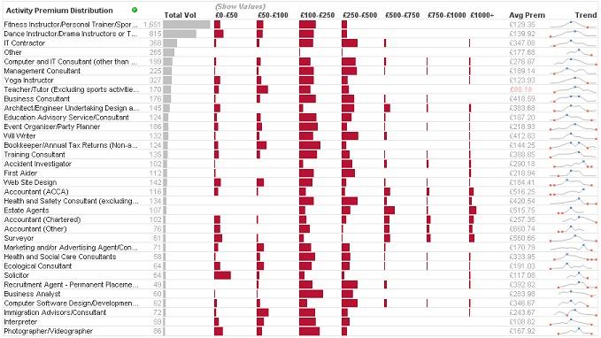
During the week, the very clever Matthew Crowther, who runs the QVDesign blog, tweeted this example:


Here he is using the "Redmond" to show premium distribution.

Today, I build a "Redmond" to show sales distribution across a companies main products:


If you haven't downloaded a copy of the original example yet, it is available from the QlikView Community.

So, here is the challenge:  What can you do with a Redmond Profile Chart?


Stephen Redmond is CTO of CapricornVentis a QlikView Elite Partner. We are always looking for the right people to join our team.
Follow me on Twitter: @stephencredmond

Friday, 12 October 2012

Introducing the Redmond Aged Debt Profile Chart

I was working with a client recently and one of the requirements was to have a report showing aged debt by client.  Most people who have worked as report developers will be familiar with this type of chart - showing the debt values broken down into buckets, quite often of 30 days.  Something like this:


This type of chart is very straightforward to produce in QlikView and something that we would do quite regularly.

While I was building it, I was thinking to myself, "this isn't very visually appealing, there must be something that I can do to enhance it".

So, this is what I did - get rid of most of the numbers, and replace them with blocks.


The first column here is essentially a bar chart.  This gives the user and immediate view of the relative sizes of the debts.

The next columns show the relative size of the values within the buckets.

With the two visualizations within the one chart, the user - probably a credit controller - can scan the page and see where the most effort needs to be made to chase debt.  Of course, being a QlikView Straight Table, each of the buckets is independently sortable so I can quickly find out all of my clients who have most of their debt in the higher buckets.

I have had a good scout around the internet (via Google, of course) and haven't come across anything similar to this for this purpose.  Therefore I am going to claim it for myself and get all the glory ;-)

I would love to hear people's thoughts about this chart and ideas about where else it might be applied.

There is an example QlikView document showing how the chart is built available for download from the QlikView Community.


Stephen Redmond is CTO of CapricornVentis a QlikView Elite Partner. We are always looking for the right people to join our team.
Follow me on Twitter: @stephencredmond

Fix for an annoying display issue in QlikView

I have had this problem for a while, but I was able to work around it so I didn't worry too much.  I even raised it with QlikView support at one stage but they weren't able to help because they could not replicate it.  They did tell me that some other people had reported the issue, so hopefully this post will help some of you out.

The issue appears in several dialogs, but it mainly irked me in the "Number" properties.


You can see that the "Symbol" and "Thousands" entry boxes are being obscured by the "ISO" and "System" buttons and the right hand side goes off the edge.  The number dialog for List boxes and Table boxes was similar except it was the "Show in Percent (%)" option being obscured by the "Document Default" buttons.

It was really just an annoyance because I could get around it.  So, after living with this issue for a while, I finally got around to Googling it this morning.  I came around this article by RL Vision:

http://www.rlvision.com/misc/windows_7_font_bug.asp

Could it be that simple?  Just make 3 tweaks to the registry?  So I did it.  Changed the "F" to and "E" in the 3 locations and:


TaDa!  All is right again.  Simple as that.

I hope this helps if you have this problem.  For me, it wasn't just confined to QlikView, so perhaps you might recognize it in other apps that you come across.


Stephen Redmond is CTO of CapricornVentis a QlikView Elite Partner.  We are always looking for the right people to join our team.
Follow me on Twitter: @stephencredmond
Wednesday, 22 August 2012

Raise a flag to the Green, White and Gray


We can sometimes forget just how powerful this feature of QlikView is.  It is so simple - you click on a value and it goes green; anything that is associated with your selection stays white; anything that is excluded by your selection goes gray.  What could be more simple?

From a data discovery point of view, this is an enormous boon.  Other tools allow you to drill down into the data with lots of different options (even Excel - although I am not really impressed with the facility from the much vaunted Tableau!) but QlikView is quite unique in giving you visibility of the excluded values.

Of course, one of the problems with List Boxes is that, to make them really useful, they do take up quite a lot of space on a layout.  I have blogged about different strategies for this in the past - for example, using a container for list boxes - but nothing quite replaces the ability to see a wide range of multivariate data in one place.

For this reason, I quite often create a tab that pretty much just has list boxes.  All the primary fields of information will be represented.


Why is it that we don't sell Women's Footwear to Argentina?

Raise a flag to the Green, White and Gray - just one of the many reasons why I love QlikView.


Stephen Redmond is CTO of CapricornVentis a QlikView Elite Partner
Follow me on Twitter: @stephencredmond

Monday, 20 August 2012

A very rounded function

The Round function in QlikView is similar to the equivalent function in Excel and other tools, but it is much more powerful.

I have used it for years, but rarely thought about its power until recently.

At a simple level, you can call the function like this:

   Round(3.14159)

Which will round the value to the nearest integer, thus giving me a nicely rounded 3.

To round to a significant number of places, instead of telling it the number of places that I want (as you do in Excel), I need to give it a step value to round to.  So, if I want to round to the nearest integer, the step value is 1.  Round to 3 places, the step value is 0.001:

   Round(3.14159, 0.001)

Which gives me 3.142 - the value is rounded to the nearest 0.001.

This is pretty much the way that I have always used the round function.  But you are not mandated to have only 1s in your step value!  How about this:

   Round(3.14159, 2)

This would yield a value of 4 - pi rounded to the nearest 2.

How about this:

   Time(Round(Time#(Times, 'HH:mm'), (1/(24*4))))

Here I a parsing a text field called "Times" that has a time value in "HH:mm" format.  I then round it to the nearest quarter hour.  Would you find that useful for log file analysis?

There is also a third parameter that we can give to Round - an offset.  So, for example, if I want to generate some random numbers:


   Load
Round(Rand()*100, 1) as RandVal
   AutoGenerate(1000000);


This would generate a range of numbers between 0 and 100.  If I look at the spread of those numbers I can see that 0 and 100 have only half of the occurrences of all the other numbers:


This happens, of course, because the range of values that will produce either 0 (0-0.4999) or 100 (99.5-99.9999) are half of the range of values that would produce and other number (e.g. 5 = 4.5-5.4999).

So I will offset each of the values by 0.5 and round those.  This will give me the result I need.


   Load
Round(Round(Rand()*100, 1, 0.5)) as RandVal
   AutoGenerate(1000000);


Simplistic example, but interesting.


Stephen Redmond is CTO of CapricornVentis a QlikView Elite Partner
Follow me on Twitter: @stephencredmond

Thursday, 19 July 2012

Lose the Legend in Line Charts

I read an interesting post this morning by Gregor Aisch entitled Doing the Line Charts Right.

One of the features that he mentions is about labeling the lines rather than having a legend.  This is not a feature that we have natively in QlikView, but it is achievable.


The "default" option in QlikView is to have a legend in the line chart.  The problem being that the user has to look to the legend then look back to the chart - which can cause difficultly, especially as the number of lines increases.

To change this, we can make use of the Value on Data Point option and using Dual in the expression.

Here is the expression that I am going to use:


 Dual(
 If(MonthYear=Max(total MonthYear), CategoryType, ''),
 Sum(Sales)
 )


Then I enable the Value on Data Point option (which you wouldn't normally apply to line charts).  The value that will be displayed is the Text in the dual, not the number (also make sure that the number format is "Expression Default") which will be blank except for the last point.  Then we end up with this:


Just what I was looking for.


Stephen Redmond is CTO of CapricornVentis a QlikView Elite Partner
Follow me on Twitter: @stephencredmond

Tuesday, 17 July 2012

Announcing the QlikTips App

A couple of interesting things happened today.

First, I noticed an interesting tweet from my good tweet-buddy, Matt Fryer, with a link to his QlikView Addict Blog post announcing that his blog is now available on Amazon Kindle.

Later in the day, I was talking QlikView with a client in Northern Ireland and he happened to mention about a friend of his who works for a cool company called JamPot, based in Belfast.  Now JamPot really have one product but it is a cool one - The App Builder.

With the App Builder, anybody who can wield a mouse can, literally within minutes, create their own app to run on various smart phones and tablets.  For free, your app is produced in HTML5 to run on most browsers.  For a slightly more commercial price, you can have your app on the various App Stores and Markets.

I seemed serendipitous that Matt should post about his blog going on Kindle and that I learned about AppBuilder on the same day, so I got to work and produced:

     The QlikTips App

I am sure that you will agree that it is a stunningly crafted application.

Save the App to your home screen so that you can have access to all my brilliant blog posts and my stunningly insightful and witty tweets in one handy location.

Did I mention that it is free?

Even if you can't possibly fit one more App on your home screen, do check out the App Builder.  Well worth a play.


Stephen Redmond is CTO of CapricornVentis a QlikView Elite Partner
Follow me on Twitter: @stephencredmond

Saturday, 16 June 2012

Collaboration? Or persuasion and excuses?

Collaborative BI - it is one of the new buzz topics in Business Intelligence.  But what does it really mean.

The good folks at Merriam-Webster define collaboration as:

   to work jointly with others or together 
   especially in an intellectual endeavor

Which is a pretty broad definition. Within BI, that can probably mean many different things, from sharing the results of data discovery with your team via email, posting an Excel file on SharePoint, or putting up a PowerPoint at a group meeting - face-to-face or Web-Ex.  There are a gamut of existing tools to support this endeavor.

I do believe that people do this all the time.  People share information from BI tools with each other.  What I am not sure about is how "collaborative" it is.  Are people sharing information because they are sharing a common purpose, or is it because they are trying to persuade people to their point of view?

The Psychology Wiki page on Collaboration has some interesting definitions of preconditions for success in collaboration.  One of which is shared objectives.  They also talk about barriers to collaboration such as reluctance to share; another is hoarding - people hoarding information as a source of power.  I guess that if an organisation has difficulty with shared objectives and people hoarding or reluctant to share then no BI solution in the world is going to help them get over that!

I work a lot with QlikView so I get to see and hear about what they think collaboration is, and the features that they have implement to support what they think collaboration is.

Funnily enough, one of the collaboration features that I have pretty much never been asked for by prospects and customers is the ability to have shared sessions on a BI tool.  Nobody ever said to me, "can we have something like Web-Ex built into the tool so that we can share sessions with other people".  That is one of the main "collaboration" features that comes with QlikView v11.  I think that it is a good feature to have, but I am not sure that it is something that people will use to choose whether to make a purchase decision over a competitor.

One collaboration feature that I have quite often been asked for over the years, and QlikView have also introduced in v11, is the ability to add commentary (called "Annotation" in QlikView 11).  I am not a fan of commentary.  One of my clients has a great name for it - he calls it "excuses".  People rarely add commentary (or at least don't add very long commentary) on green traffic lights.  It is the red light that gets the commentary - "why we didn't make the numbers".

So far I am still to be convinced that collaboration features like this are going to be a really big deal in BI (although the marketers may make it so!).  I don't believe that it really is reflective of how people work in the real world.  There are some problems around the way people work together collaboratively, and those aren't going to be solved by a software solution - no matter how cool it is.


Stephen Redmond is CTO of CapricornVentis a QlikView Elite Partner
Follow me on Twitter: @stephencredmond

Friday, 8 June 2012

Homage to Minard

It is amazing to me that I can work with a product like QlikView for 6 years and still come across new things all the time.

Recently, my good friends The QlikMonkey, posted a visualization about why the soccer team, Manchester United, lost the English Premier League:


They were also kind enough to share some other work that they had done to create similar parallel coordinate charts like this.

One of the things that I noticed about it was that some of the lines had different widths - I hadn't known that we could do this in QlikView!!!

I had always known about the different options that we could add expressions to under an expression in a chart, e.g. Background, Bar Offset, Text Color, etc.  One of those is "Line Style".  I had thought (and this is correct) that was to do with creating different types of line such as dashed.  I didn't realize that we could also use this property to dynamically change the widths of lines.

This is from the QlikView Help file:

"The relative width of the line can be controlled by including a tag <Wn> where n is a multiplying factor to be applied on the default line width of the chart. The number n must be a real number between 0.5 and 8. Example: <W2.5>."

It occurred to me that I might be able to use this feature to replicate one of the classic charts in visualization history - Charles Minard's chart of the losses suffered by Napoleon during the disastrous Russian campaign of 1812/13, which he drew in 1869.  Even Edward Tufte, one of the modern-day guru's of data visualization, described this as "probably the best statistical graphic ever drawn".


I created a data set of X, Y coordinates along with the volume of soldiers for each point (field called "Count").  A separate set for each direction (and spur line).  I then created the line chart and used a % of the Max value to calculate the appropriate "W" value for the line:

='<W' & Round(0.5+(Sum(Count)/Max(total Aggr(Sum(Count), X))*7.5),0.1) & '>'

And here are the results:


Obviously this is not an exact replica.  If I was doing it again, I would include more data points to get finer detail.  But as a proof-of-concept, I believe it is a good enough effort.


Stephen Redmond is CTO of CapricornVentis a QlikView Elite Partner
Follow me on Twitter: @stephencredmond

Saturday, 19 May 2012

Good use of pie charts?

FlowingData, one of the people that I follow on twitter, has blogged today about how the visualization below, published by the Wall Street Journal, was a good use of pie charts.


Unfortunately, I have to completely disagree!

I am not against pie charts in a part-to-whole comparison (see QlikTips: Defending Pie Charts) but using them for this type of comparison is not good.

There are two things being encoded by these pie charts:

-  percentage of shares being sold in the IPO - represented in the traditional pie segment fashion.

-  volume of shareholding - represented by the size of the circle.

The first is OK in one single pie chart showing one part-to-whole comparison.  However, the second is a very poor way for us to compare two values - especially when they are not side by side.  Taken together, it is almost impossible to get any real insight from this chart.

As an example, how easy to you find it to compare the 50% pie chart against Tiger Global versus the 6% slice in Mark Zuckerberg's pie?  You can't - it just isn't possible.  The reality is that the 6% is actually much bigger than the 50% in actual share volume.


I would contend that a bar chart is almost always the best medium to represent this type of information.  It is so much easier to interpret and see the values.


Stephen Redmond (@stephencredmond) is CTO of CapricornVentis a QlikView Elite Partner

Tuesday, 15 May 2012

Good Geographic Charting

I am not generally a fan of geographic mapping.  I have seen very few examples of it done well.

The problem is often the geography is not always directly proportional to the value being measured.  Take this example from The New York Times:


This is not an atypical image that one would see in this area.  A color is applied to each of the states to indicate a measure.  In this case, it is current Democrat (blue) versus Republican (red) support.

By the looks of this map, the republicans are doing very well.  But there is a distortion because many sparsely populated states and hence lower electoral college votes (e.g. Montana - 3, Wyoming - 3, Idaho - 4, South Dakota - 3, North Dakota - 3) have a large land mass.  On the other hand we have states with small land masses (e.g. New Jersey - 14, Massachusetts - 11, Maryland - 10, Connecticut - 7) that have much higher density populations and hence more electoral college votes.  Texas (38 votes) has a much bigger area than other states but it is actually California (55 votes) with the biggest vote.  Hawaii (4) is way smaller in area than Alaska (3), but it has one more vote.

The New York Times have actually taken a much better approach in their main Electoral Map.


This time they have changed the size of each state to represent the actual number of electoral college votes that they have.  Now, the map shows a much smaller swathe of red through the middle and more reflects the reality that (currently) the Democrats have a slight lead.

I really like this because it is a more accurate heat map while still retaining the geographic context.

I thought about how this might apply to Europe.  We are used to seeing a map like this (from Google Maps):


But the land area occupied by a country doesn't always reflect its population size.  I knocked-up this visualization in QlikView:


I haven't applied any color coding to this yet but it does give you an idea of how the populations are sitting.  For example, Sweden has a much bigger land area than Germany (about 450k km² versus about 360k) but has a much lower population (9.3m v 81.7m).  Iceland changes from a large island to a small speck in the ocean.

As with all charts, it is important to make sure that context is not skewed.  This method of geographic charting helps maintain the contexts.


Stephen Redmond is CTO of CapricornVentis a QlikView Elite Partner

Monday, 14 May 2012

Brushing Heatmaps

I picked up a fun visualization from Matt Styles on thedailyviz.com called "How common is your birthday"?

Some of the commentary - especially from Andy Kirk - made me think a bit about how we use heatmaps.  So, I fired up QlikView, grabbed the data from The New York Times, and opened up a link to Color Brewer.

The map in question shows us the rank of each of the days of the year as regards number of births - rather than the actual numbers.  Here is my representation using a QlikView pivot chart:


The code for the color is:

ColorMix1(Rank/366, RGB(0,68,27), White())

I believe that there is a fundamental flaw representing this number of points (obviously 366) in a heat map where the value is the rank versus the actual value.  The flaw is that the difference in color does not give us the difference in magnitude between the different blocks.

With this number of blocks, I can see that there is an obvious pattern of darker colors in July-September, but I find it very difficult to pick out, among the sea of darker colors, the ones that represent the actual top ranked days.

Feeling that this might be something that people might want to do, I thought about how I might do it in QlikView and came up with this variant:


Here, I am using a second color range to represent the top 10 (all in September) and the bottom 10 (with February 29th obviously being the lowest).

Essentially, I this is an example of brushing but applied to a heatmap.

The code for the mixed block is:


if(Rank <= 10, ColorMix1(Rank/20, RGB(12,15,124), White()),
if(Rank > 356, ColorMix1((367-Rank)/20, RGB(179,0,0), White()),
ColorMix1(Rank/366, RGB(0,68,27), White())))


It would be a fairly straightforward matter to give the user an interactive facility to turn on/off the Top 10 or Bottom 10.


Stephen Redmond is CTO of CapricornVentis a QlikView Elite Partner

Tuesday, 8 May 2012

If you don't know where you are going, then you'll probably get there

It is one of the main set of KPIs that a lot of our customers look for in any BI implementation.  They want to see performance versus the same period last year.  Or perhaps the year to date.  Or maybe a moving annual total.


Mr. and Mrs. Doe leave their house to go for a drive to somewhere.  After about an hour, Mr. Doe asks Mrs. Doe how far they have come since they left home.  She confirms that they have successfully traveled approximately 100km from their point of origin.  Satisfied, Mr. Doe continues on.

After about another hour, he asks again how far they have gone.  Again, Mrs. Doe confirms that they have traveled approximately 100km from the last checkpoint.  They continue on the way.  Each time checking that they have traveled the appropriate distance since the last checkpoint.  After 4 hours, Mr. Doe is surprised to find that they have arrived back in their home town, but on the wrong side of the tracks, and their gas tank is running low!

Look at the image above.  It is a KPI showing that our YTD is well down on the previous year.  There must be wailing and gnashing of teeth at the next board meeting.  However, let us consider what this is measuring.

Unless you have an extremely stable business, your sales in any one period will actually be influenced by multiple different factors - many of which you have had no control over.  It is, effectively, a random number.  If I was in the Energy business in the UK, this chart might reflect my business - but is that because of the weather?  January 2011 was far milder than January 2010 so my sales will have been down.  In 2010, they would have been up and everyone would have been smiling - but it was because of the weather, not anything that I had control over.  If I was a retailer, Easter 2010 was in early April so I might have had a seasonal spike in sales in late March.  Easter 2011 was late in April so the spike might not have kicked into the QTD figures.  Hence sad faces on the shop floor.

What if the figures are up on last year?  Does that mean that I need to give everyone a extra holiday to celebrate?  Not necessarily.  Again, lots of different things might be affecting the numbers.  Perhaps you launched a new product.  Maybe you hired a whole load of sales people in a new territory and the stock is flying off the shelves.  Your business this year will be so different from your business last year that comparing the two is comparing apples and oranges.

There is a better way.


Mr. and Mrs. Roe leave their house in Ellsworth, WI, planning to take a drive to Lake Wisconsin - about 4 hours away.  Before they leave, they plan their journey on the map and mark out whey they should be at each hour.  After the first hour of the journey, Mr. Roe asks Mrs. Roe how far they are from their first marker.  She tells him that they are a little short of it.  Mr. Roe is a careful driver and has been driving a bit under the speed limit so he gives it a little more gas.

After about another hour, he checks in again about how for they are from the next target.  This time they are a little ahead.  He knows that he could take his foot off the gas a little but decides that he wouldn't mind getting there a little earlier.  He lets Mrs. Roe know this and she readjusts the markers.  They ended up reaching their destination ahead of time and had a great time at the lake.

A business should not be relying on random events to compare how they are doing.  If I am a retailer, I will know when the major holidays are going to occur.  I will look at my last year figures, apply some thought as to where I can see growth, apply some mathematics, and come up with a sales forecast for the year - a forecast that should reflect the strategic direction of the company.  If things change (like a really good summer!), I can change the forecast to reflect things.  If I am in the energy business, I will be constantly looking at long range weather forecasts and modifying the sales forecast.

So, unless your year-on-year business is extremely stable, comparing one set of effectively random numbers against another set isn't really going to tell you much about your business.  Comparing them against a well thought out and planned set of numbers is going to tell you exactly where you are going and then the KPI is going to let you know if you need to intervene and change things - exactly what a KPI should do.

If you don't know where you are going, then you'll probably get there.


Stephen Redmond is CTO of CapricornVentis a QlikView Elite Partner

Monday, 23 April 2012

Change Their World

A guy I never met before just gave me $10 cash.  He challenged me to turn that $10 into $100.  His name is Phil Wall and he runs Hope HIV.

As it happens, I recently started running and am training for my first ever road race.  It is only 4k but we all have to start somewhere.  The race is in 2 weeks and training is going well.  I thought that it might be a great idea to combine the two and make that $100 from sponsorship.
The choice of HopeHIV was prompted by QlikView's "Change Their World" program.  The company deserves a lot of respect for their sense of social responsibility.

HopeHIV is a great cause and I hope you can help me out.

You can contribute at my JustGiving page - the money goes straight to the charity.


Stephen Redmond is CTO of CapricornVentis a QlikView Elite Partner

Friday, 30 March 2012

Miami here I come

It's that time of year again where I am looking forward again to "Qonnections", the QlikView global partners conference.  This will be the 3rd year in a row where we will be at the Fontainebleau Resort in South Beach, Miami Beach.  It kicks off on Sunday 22nd April and finishes up on the following Wednesday.

I have to say that my favourite Qonnections was 4 years ago in the Lowes Hotel, also in South Beach. There were a number of reasons:

 - Jonas Nachmanson, then CTO, announced Set Analysis coming in version 8.5. The techies in the audience gave the announcement a standing ovation.

 - Stephen Few delivered the keynote speech on the first morning. This changed pretty much everything about the way I have delivered QlikView projects since then.

 - Capricorn Ventis won the award for the fastest growing partner. It was a great experience to win an award at an event like this.

 - I attained certification in the brand new "Professional" Certification program. Earlier that year I had been one of the first people in the world to achieve the new "Developer" Certification.

So, there were a lot of highs that year. I would have to say that subsequent Qonnections were somewhat lesser in the number of highs.

I think that maybe, for me, it is that Set Analysis was the last "great" innovation in QlikView. There have been a lot of "nice" features in subsequent releases, and good features to make the product more enterprise ready, but none of them changed the way that I used the product so fundamentally. I don't think that there has been 1 .qvw that I have created in the last number of years that has not used Set Analysis.

I have an idea that this year might have some more interest. I think that v12, whose features (without promises of final delivery) will probably be announced to partners next month. I don't know, but I suspect that there will be some really interesting things happening and perhaps some fundamental changes. Of course, I will be restricted from commenting on them until they are made public, but I might whet your appetite.

Enjoy the tune - Will Smith, Miami


Stephen Redmond is CTO of CapricornVentis a QlikView Elite Partner

Wednesday, 21 March 2012

Where are the Irish going? Another poor pie chart.

Oh dear.  Yet another poor example of a pie (in fact a doughnut) chart to try and get across something that is very important to Irish people.

David McWilliams is a leading Irish economist.  One of the few to predict trouble many years before the crash, mostly not listened to.  I think that he has a wonderful grasp of world economics and how they apply and interlink with Irish economics.  Unfortunately, when he described the chart below as a "wonderful graphic on Irish emigration", he showed that, like many, he doesn't know much about the presentation of quantative data.

The chart in question is found here:  http://www.locusinsight.com/Ireland_files/Emigration/chart.html

It is an "interactive" doughnut chart where each segment represents the number of people going to different locations around the world.

Besides all the usual issues with pie type charts (my blog post on "Defending Pie Charts" might be a good place to start reading about the problem with pies; and of course, Stephen Few's Save the Pies for Dessert), the whole interactive thing makes it even more difficult to grasp the numbers and the relationship between them.

I grabbed the numbers from the chart into QlikView and created a much simpler, but far more effective, line chart:

(click for larger image)

From this chart, it is quite easy now to see that there is a general trend upwards in emigration and the UK and Australia are the main destinations.  There is a huge spike in EU12 (the 12 countries that have joined the EU since 2004) during 2009.

I had my suspicions of what that was so I went to the Irish Central Statistics Office website and retrieved the figures for emigration by nationality.


(click for larger image) 

This confirmed what my suspicions were - many of the eastern Europeans (Polish, Lithuanian, Latvian, etc.) who had emigrated into Ireland during the Celtic Tiger years, many of whom worked in the construction industry, left in 2009 because of the collapse of that industry.

"Fancy" charts often actually hide the numbers that people want to see.  Here we have two very plain and simple line charts that tell much more of a story.

It is not a great story if you are Irish.


Stephen Redmond is CTO of CapricornVentis a QlikView Elite Partner

Sunday, 18 March 2012

What are the colour of your eyes?

I often find myself reading other blogs, in the name of "research", and finding myself jumping from one link to another, following one idea to another, storing lots of fascinating facts within my grey matter (in theory).

One of my favourites is Robert Kosara's Eager Eyes blog.  Recently, he was discussing writing as a metaphor for visualisation which led me, via a couple of hops, to an IBM research piece called "How NOT to Lie with Visualization", written by Bernice E. Rogowitz and Lloyd A. Treinish of the IBM Thomas J. Watson Research Center, Yorktown Heights, NY.

The article is a discussion of colour maps used in visualisation.  It is worth reading.

My own rule of thumb for a colour map is to use just the one hue - e.g. Blue, because it is relatively neutral - and change the lightness of the colour from one end of the scale to the other (e.g. using ColorMix functions in QlikView).  If I need diverging scales, then use two different hues that go from light in the centre to dark at the extremities.  For this, I always imagine an old ordinance survey map that shows sea and land - as the sea gets deeper, the blue gets darker; as the land gets higher, the brown gets darker.

Of course, there is always the question of ability to discern the difference in colours in between those extremities and whether a colour map is suitable at all - some humans are much better than others.  So what can we do for those of us whose eyes are not so good?

In many cases, I will implement a simple rule - anything that needs investigation based on the business rule gets coloured, everything else stays neutral.

Monday, 13 February 2012

Move your QlikTech ProgramData folder

There are a number of reasons why you would want to move the C:\ProgramData\QlikTech folder to somewhere else.  For example:

-  Disk size issues 

The C: drive too small and the QlikView performance logs, reload logs, etc. are filling it up.

-  Failover

You have a "cold" standby server and it would be much better to have the ProgramData\QlikTech folder on the SAN drive so that when the cold server boots up, it will already have all the settings, schedules, etc. from the old server.

There are ways of moving the ProgramData folder - the supported one from Microsoft (with caveats!) is to do it during the installation of Windows - http://support.microsoft.com/kb/949977

This isn't really going to be an option for you if the server is already built by the nice friendly folks in the IS department.  They might also object to you trying to move the whole ProgramData folder anywhere else, just for QlikView.

I have run into this situation a couple of times now and there is a really neat solution - move the QlikTech folder to its new home and then create a symbolic link in the old ProgramData folder.  Everything will still work perfectly!

To do this:

1.  Stop all of the QlikView services.

2.  Move the QlikTech folder from C:\ProgramData to its new location, for example E:\ProgramData.

3.  Run a Command Prompt in Admin mode.  CD to the C:\ProgramData folder and run the following command:

     MKLINK /D QlikTech E:\ProgramData\QlikTech

4.  Restart all of the QlikView services.

All done.  Do the same on the "Cold" server (you will need to bring down the "hot" server first) and create the same symbolic link to the same SAN location and it will work as if it was the "hot" server and no need to ship settings files.

Hopefully you will find this useful.


Stephen Redmond is CTO of CapricornVentis a QlikView Elite Partner

Printing Reports to PDF using PDFCreator

PDF Creator is a nice tool for generating PDFs and it comes at a very attractive price.  Like other tools of this ilk, it creates a Printer driver which you can print your documents to.  Unlike other drivers (especially at this price point), it gives you additional control on what is printed using a COM interface.  This makes is quite handy to use from VBScript - either inside or outside QlikView.

I am going to give you some starter code here on how to do this from within a QlikView document using a Macro.  You can also do this from a .vbs file that is external to QlikView.  Just note that if you are using a .vbs then you will still need an appropriately licensed copy of QlikView Desktop to run this.

*** All script here is completely unsupported by myself or anyone at QlikTech.  Use at your own risk ***

If you are going to use a .vbs then you will need to create your own ActiveDocument variable.  This is how I do that:


    Dim QV, ActiveDocument


    set Qv = CreateObject("QlikTech.QlikView")
    

    QV.OpenDoc Document,"",""

    set ActiveDocument = Qv.ActiveDocument


In this case, the variable Document contains the full path to my .qvw.  The 2nd and 3rd parameter are a QVUser and Password - if you have those in Section Access.  Once you have an ActiveDocument object, the code is the same between the Macro and the .vbs.

Usually when I do this, I am going to loop across all the value in a field.  For example, I may have a field called "Seg" and I want to run a report for each value in this field.

I may choose to clear all values first:


ActiveDocument.ClearAll


Either way, I can call the GetPossibleValues to get a list of all the values in that field:


    Dim FieldName
    
    FieldName = "Seg"


    set mySelections = ActiveDocument.Fields(FieldName).GetPossibleValues


Now, I can loop through the values, select each one in the document and call a function that I have made called Print_PDF for each value:


    Dim i


    for i = 0 to mySelections.Count - 1


        Dim FieldValue


        FieldValue = mySelections.Item(i).text
        
        ActiveDocument.Fields(FieldName).Select FieldValue


        Print_PDF FieldValue, "My Report", "RP01"
        
    Next


Print_PDF is, essentially, using the reference code from the PDF Creator documentation:


Sub Print_PDF(FieldValue, ReportName, ReportID)


    ' Designed for early bind, set reference to PDFCreator
    Dim pdfjob
    Dim sPDFName
    Dim sPDFPath


    '/// Change the output file name here! ///
    sPDFName = ReportName & " - " & FieldValue
    sPDFPath = "C:\PDFReports"


    Set pdfjob = CreateObject("PDFCreator.clsPDFCreator")


    With pdfjob


      If .cStart("/NoProcessingAtStartup") = False Then
         If .cStart("/NoProcessingAtStartup", True) = False Then

          Exit Sub

         End if
         .cVisible = True
      End If


      .cOption("UseAutosave") = 1
      .cOption("UseAutosaveDirectory") = 1
      .cOption("AutosaveDirectory") = sPDFPath
      .cOption("AutosaveFilename") = sPDFName
      .cOption("AutosaveFormat") = 0 ' 0 = PDF
      .cClearCache


    End With


    ' Print the QlikView Report
    ActiveDocument.PrintReport ReportID, "PDFCreator"


    'Wait until the print job has entered the print queue
    Do Until pdfjob.cCountOfPrintjobs = 1
     ActiveDocument.GetApplication.Sleep 20
        ' in VBScript use WScript.Sleep(20)
    Loop
    pdfjob.cPrinterStop = False


    'Wait until PDF creator is finished then release the objects
    Do Until pdfjob.cCountOfPrintjobs = 0
     ActiveDocument.GetApplication.Sleep 20
        ' in VBScript use WScript.Sleep(20)
    Loop
    pdfjob.cClose
    Set pdfjob = Nothing


End Sub


The only additional piece here from the PDF Creator documentation is the QlikView call to Print the report:


    ActiveDocument.PrintReport ReportID, "PDFCreator"


I pass the field value and a ReportName value into the function so that I can generate a different PDF file name for each field value.

Last thing is that you will need to enable System Access in the Macro settings.  In a way, this is where .vbs has an advantage.  Because the script is already external, there is no issue with enabling System Access.

Enjoy.  Just remember, this is all unsupported so use at your own risk.


Stephen Redmond is CTO of CapricornVentis a QlikView Elite Partner