Tuesday, 31 May 2016

Pie charts and perceptual anchors

There have been some information on a couple of really excellent research papers on pie charts released today from Robert Kosara (@eagereyes) and Drew Skau (@SeeingStructure) :

https://eagereyes.org/papers/a-pair-of-pie-chart-papers

I had, coincidentally, been doing some research of my own on perceptual anchors and how that relates to performance of pie charts versus stacked bar charts in part-to-whole comparisons. It would suggest that pies are not the terrible bad-guy after all. Who knew!


Stephen Redmond is a Data Visualization professional. He is author of Mastering QlikView, QlikView Server and Publisher and the QlikView for Developer's Cookbook
Follow me on Twitter   LinkedIn

Sunday, 21 February 2016

Fundamental rules of data visualization

There are many "rules" of data visualization that we read in many publications. Some contradict others and some just don't make any sense. Some are accompanied by extensive amounts of proofiness, but often is missing appreciation of the fundamentals. I can use algebra to prove to you that 1+1=1, using perfectly legitimate algebraic transformations, but it is invalid because it breaks a fundamental rule (for those who are interested, I will add it at the end of the post).

I like to preach three fundamental rules of data visualization to those who will listen:

1.  Data visualization is all about ratios
This is so fundamental as almost ridiculous to have to mention, but we need to mention it. Any visualization that seeks to juxtapose several values for interpretation must do so using some kind of visual ratio.

There are many kinds of visual ratios and some are more effective than others. Cleveland and McGill (1984) gave us the order of effectiveness of interpretation for these ratios:

  • Position on a common scale
  • Position on non-aligned scales
  • Length
  • Direction
  • Angle
  • Area
  • Volume
  • Curvature
  • Shading
  • Color saturation

To try and create a data visualization that is not based on some kind of visual ratio is a fundamentally flawed approach. Every ratio is not always appropriate for every visualization either, so we need to learn about what works where.

2.  Data visualization is all about context
We can create the most wonderfully beautiful bar charts and present them on a large screen in Times Square or print them on the most opulent paper in the most vivid colors, but without context they are just rectangles.
Context devices will include such simple elements as titles and axes - enough annotation so as to allow the reader to understand exactly what they are looking at.
As Amanda Cox, Graphics Editor at the New York Times, said in her Eyeo Festival talk:

The annotation layer is the most important thing we do... otherwise it's a case of here it is, you go figure it out.

3.  Data visualization is about SFW
This is the most important thing from a business point of view - and good data visualization is about creating a good solution for the business. SFW stands for So What.
I will always remember the day when I had spent hours on a great dashboard to present to a board-level executive at one of our most important clients. It was technically awesome! Really pushing the boundaries of what the tool could do.
I proudly showed it off at the executive presentation. My client sat patiently through it until, finally, he looked me straight in the eye and said:

So f***ing what?

He was right of course. My technically advanced dashboard had a huge fundamental flaw - I had failed to connect it correctly to the business problem. It wasn't a good solution at all - except in my head.
Fundamentally, we need to make sure that our data visualizations connect with the audience that they are intended for. The first two rules give us the correct technical result, the last gives us the brilliant business solution.

We can create some great business solutions by following these three rules. They may not look great, they may have garish colors, but if the CEO is able to use them to track his business then that is a very good dashboard.

To achieve glory among your peers, you need to start going beyond the fundamentals. Learn what works and what doesn't in most situations. Know when you should use a pie chart and when you shouldn't. Learn how to lay things out. Learn the best colors to use. This does lead to a fourth rule that could be considered fundamental:

4.  Get out of the way and show the numbers
We don't talk about all the color and layout stuff for the good of our health. There are good reasons for doing things in the ways that you will read about in the books. Learn about the reasons for good consistent layout, easy on the eye colors and clean presentation.
Above all, learn that if we don't follow the fundamentals then we start to potentially obscure the data, and this is a flaw that is important to correct.
Get out of the way and show the numbers.


For those that are interested, 1 + 1 = 1:

a = b = 1

a = b

a^2 = ab

a^2 - b^2 = ab - b^2

(a + b)(a - b) = b(a - b)

a + b = b

1 + 1 = 1


Stephen Redmond is a Data Visualization professional. He is author of Mastering QlikView, QlikView Server and Publisher and the QlikView for Developer's Cookbook
Follow me on Twitter   LinkedIn

Tuesday, 2 February 2016

How to lie with charts - crude oil versus retail gasoline prices

After watching a news item this morning, I posted the following question to social media:

If oil has dropped from > $100 / barrel to < $30, why are consumers still paying > €1 / litre?

There were some interesting responses. There was in my mind a suspicion that the retail prices were not coming down as quickly as the crude prices - but I had nothing to back that up with. I decided to investigate.

Taking crude oil prices from US Energy Information Administration and monthly retail price data from AA Ireland, I put the two together quickly in QlikView. I decided to fix the time period to January 2010 to January 2016, as the last time the Irish government added an additional excise duty to fuel was in December 2009, so I knew that wouldn't interfere with the figures.

I plotted the data on a time series and, Aha!:


"Black and white!", I thought to myself. How obvious. While the crude price has been dropping like a stone, the retail price has had a much gentler decent. I better get straight onto the press to reveal the petrol companies evil intent towards the good people of Ireland.

But wait! There is a real problem here. The problem is that we have started both axes at zero - which is usually a sacrosanct rule. However, in this case, because we are not comparing the same value ranges, it is actually a mistake. By forcing both ranges into one area, I am actually distorting both of them.

In QlikView, the fix is simple, we just take off the force zero option for both expressions, revealing a much different state of affairs:


The crude and retail prices have actually been varying in a very similar way over the period. If I calculate the Pearson's correlation coefficient for these two series, it comes out at aproximately .77 - which is generally considered a high correlation for this type of data. In fact, if I drill into the last couple of years, the correlation is even tighter:


The correlation coefficient for the last 25 months data calculates at approximately .95!

Any data scientists in the room might be tempted to normalize the data (calculating the z-scores) so that we can plot them on the same axis. When we do, we get a similar view to the one above:


And here is an example in Qlik Sense Cloud:


So, perhaps the oil companies are playing a straight bat on this one. There are many different variations into what goes into the retail price of a litre of fuel. The crude oil price is one of those, but quite significant. If we can see a good correlation between the two, then we can have some sense of confidence that all is operating fairly.

The main point here though is that it is quite easy in a lot of visualisation tools to accidentally tell the wrong story. You may have best intentions, but you may end up telling visual lies.

Be careful out there!


Stephen Redmond is a Data Visualization professional. He is author of Mastering QlikView, QlikView Server and Publisher and the QlikView for Developer's Cookbook
Follow me on Twitter   LinkedIn

Friday, 29 January 2016

CRISP-DM for Data Viz projects

Do you have a methodology for implementing Data Visualization projects?

How do you go about working with your stakeholders to deliver value?

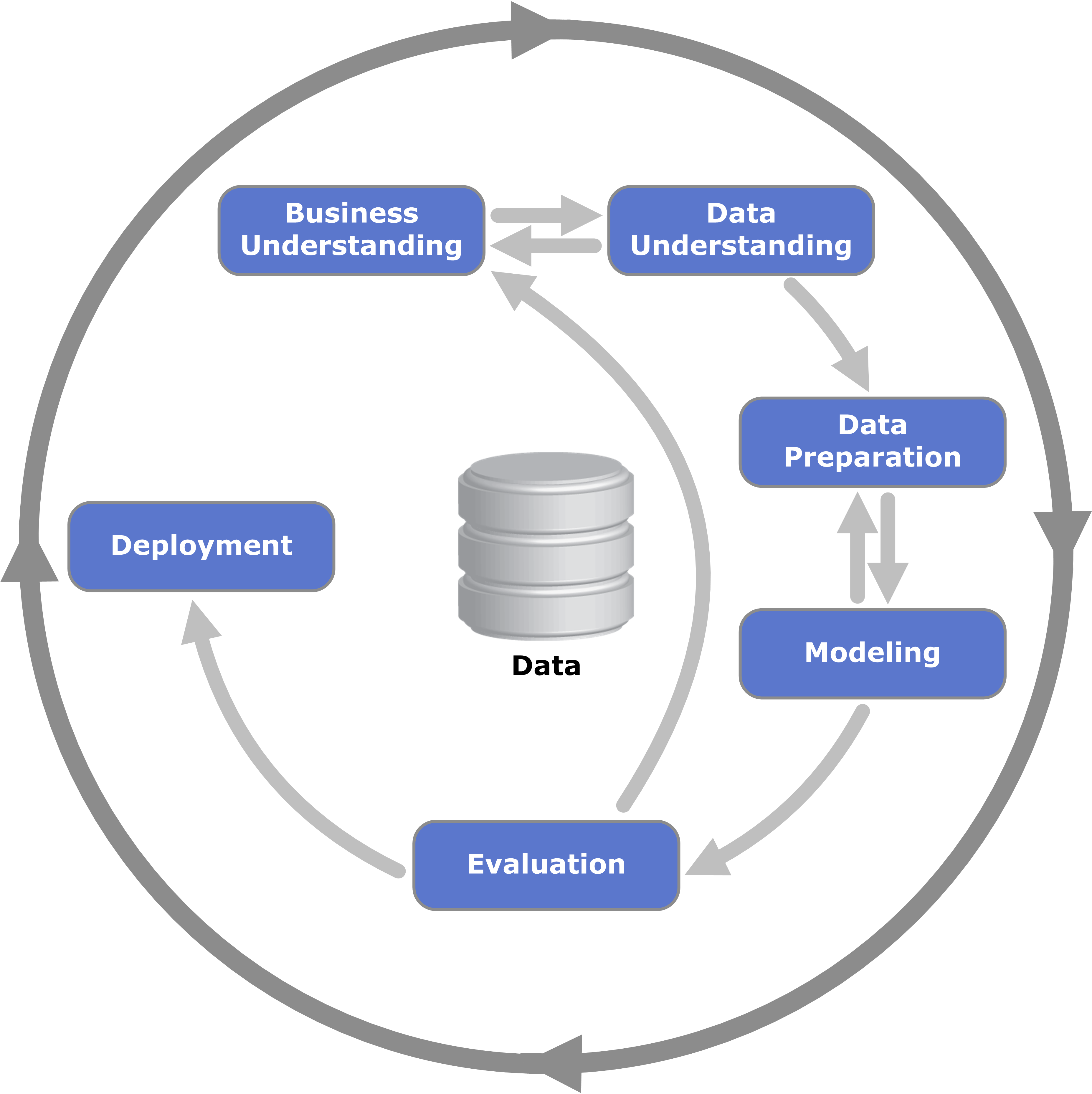
The conception of CRISP-DM is 20 years old this year. It was conceived of as a process to formalize data mining (Cross Industry Standard Process for Data Mining) but if we have a look at the diagram below, it really fits for data visualization too!


When do we not do all of these steps in a data visualization project? If you are not doing them, why not? I'm OK if you don't, as long as you know why you are not.

It is definitely worth a data visualization practitioners while to review the documentation - much of it freely available online (start with CRISP-DM 1.0 Step-by-step data mining guides)


Stephen Redmond is a Data Visualization professional. He is author of Mastering QlikView, QlikView Server and Publisher and the QlikView for Developer's Cookbook
Follow me on Twitter   LinkedIn